UIkit Table
UIkit Table– Class uk-tableis used to create table in UIkit framework. You can use predefined classes to create beautiful tables in UIkit framework. Here in this article we are going to explain how you can create tables in UIkit with different-different styles.
UIkit Table Example
Add class uk-table to table. Here is simple example of UIkit table. –
Example:
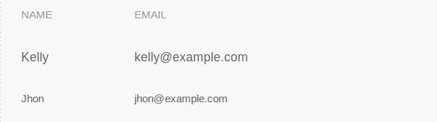
<table class="uk-table">
    <thead>
        <tr>
            <th>Name</th>
            <th>Email</th>
        </tr>
    </thead>
    <tfoot>
        <tr>
            <td>Jhon</td>
            <td>jhon@example.com</td>
        </tr>
    </tfoot>
    <tbody>
        <tr>
            <td>Kelly</td>
            <td>kelly@example.com</td>
        </tr>
    </tbody>
</table>
|
If you run the above example it will produce the output something like this-
Add Row Divider
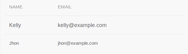
Add class uk-table-divider to add divider between table rows.
Example:
<table class="uk-table uk-table-divider"> <thead> <tr> <th>Name</th> <th>Email</th> </tr> </thead> <tfoot> <tr> <td>Jhon</td> <td>jhon@example.com</td> </tr> </tfoot> <tbody> <tr> <td>Kelly</td> <td>kelly@example.com</td> </tr> </tbody> </table> |
If you run the above example it will produce output something like this-
Striped Row
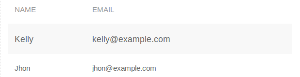
Add class uk-table-striped to create striped table row.
Example:
<table class="uk-table uk-table-striped"> <thead> <tr> <th>Name</th> <th>Email</th> </tr> </thead> <tfoot> <tr> <td>Jhon</td> <td>jhon@example.com</td> </tr> </tfoot> <tbody> <tr> <td>Kelly</td> <td>kelly@example.com</td> </tr> </tbody> </table> |
If you run the above example it will produce the output something like this-
Hover Effect
If you want to add the hover effect on table rows add class uk-table-hover to table.
Example:
<table class="uk-table uk-table-hover"> <thead> <tr> <th>Name</th> <th>Email</th> </tr> </thead> <tfoot> <tr> <td>Jhon</td> <td>jhon@example.com</td> </tr> </tfoot> <tbody> <tr> <td>Kelly</td> <td>kelly@example.com</td> </tr> </tbody> </table> |
Responsive table
To make table responsive add class uk-overflow-auto to div wrapper and add table inside it. Table will be automatically responsive on all devices.
Example:
<div class="uk-overflow-auto"> <table class="uk-table"> <thead> <tr> <th>Name</th> <th>Email</th> </tr> </thead> <tfoot> <tr> <td>Jhon</td> <td>jhon@example.com</td> </tr> </tfoot> <tbody> <tr> <td>Kelly</td> <td>kelly@example.com</td> </tr> </tbody> </table> </div> |
Advertisements
Add Comment
📖 Read More
- 1. UIkit List
- 2. UIkit Pagination
- 3. UIkit Progress Bar
- 4. UIkit Spinner
- 5. UIkit Divider
- 6. UIkit Totop scroll
- 7. UIkit Tile
- 8. UIkit Notification
- 9. UIkit Tab


