UIkit Tab
UIkit tab– This component allows us to create the tabs in UIkit framework. This component contains tabs aligned in single row that are clickable. Here in this article, we are going to explain how to create tabs in UIkit framework. You can also our online editor to edit and run the code online.
UIkit Tab Component Syntax & Example
Let us first create simple UIkit Tab-
Example:
<ul uk-tab>
    <li class="uk-active"><a href="">Tab 1</a></li>
    <li><a href="">Tab 2</a></li>
    <li class="uk-disabled"><a href="">Tab 3</a></li>
</ul>
|
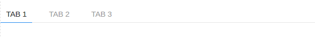
If you run the above example it will produce output something like this-
Following classes and attribute are used to create tabs in UIkit.
| Class/Attribute | Description |
|---|---|
| uk-tab | Add attribute uk-tab to <ul> and then add <a> elements as tab items within the list. |
| .uk-active | This represents active state. |
| .uk-disabled | This represents disabled state. |
Bottom Modifier
Class uk-tab-bottom is used to add the tab bottom
<ul class="uk-tab-bottom" uk-tab>...</ul>
Example:
<ul uk-tab class="uk-tab-bottom"> <li class="uk-active"><a href="">Tab 1</a></li> <li><a href="">Tab 2</a></li> <li class="uk-disabled"><a href="">Tab 3</a></li> </ul> |
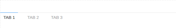
If you run the above example it will produce output like this-
Left | Right Modifiers
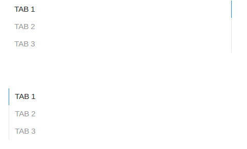
You can use class uk-tab-left and uk-tab-left to create vertical tabs. Class uk-tab-left is used to place the divider to left and uk-tab-right is used to place the divider right of tabs.
Example:
<ul uk-tab class="uk-tab-left"> <li class="uk-active"><a href="">Tab 1</a></li> <li><a href="">Tab 2</a></li> <li class="uk-disabled"><a href="">Tab 3</a></li> </ul> <ul uk-tab class="uk-tab-right"> <li class="uk-active"><a href="">Tab 1</a></li> <li><a href="">Tab 2</a></li> <li class="uk-disabled"><a href="">Tab 3</a></li> </ul> |
If you run the above example it will produce output something like this-
Advertisements


