UIkit Form
UIkit Form– UIkit provides classes to create beautiful form with different styles. Here in this article we are going to explain how you can use pre defined classes to create form elements. You can also use our online editor to edit and run the code online.
UIkit Form | Input | Controls Example
Let us create a simple form with basic elements.
Example:
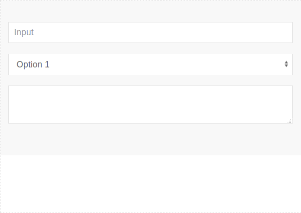
<form>
	<div class="uk-margin">
	    <input class="uk-input" type="text" placeholder="Input">
	</div>
	<div class="uk-margin">
	    <select class="uk-select">
		<option>Option 1</option>
		<option>Option 2</option>
                <option>Option 3</option>
	    </select>
	</div>
	<div class="uk-margin">
	    <textarea class="uk-textarea"></textarea>
	</div>
</form>
|
If you run the above example it will produce output something like this-
Input Classes
Following classes are available which you can use to create form elements.
| Name | Class | Description |
|---|---|---|
| Input | .uk-input | This is input class, add to <input> elements. |
| Select Box | .uk-select | This is select class, add this to <select> elements. |
| Textarea | .uk-textarea | This is textarea class, add this to <textarea> elements. |
| Radio Button | .uk-radio | This is radio button class, add this to <input type=”radio”> elements. |
| Checkbox | .uk-checkbox | This class is used to create checkboxes, Add this class to <input type=”checkbox”> elements. |
| Range | .uk-range | This class is used to create range element add this to range element <input type=”range”>. |
State Modifiers
Following state modifier classes are available-
| Class | Description |
|---|---|
| .uk-form-danger | This is used to represent the danger state such as error message. |
| .uk-form-success | This is used to reresent that action has been successfully performed. |
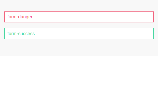
Now let us create a simple example.
Example:
<form>
	<div class="uk-margin">
    <input class="uk-input uk-form-danger" type="text" placeholder="form-danger" value="form-danger">
	</div>
	<div class="uk-margin">
		<input class="uk-input uk-form-success" type="text" placeholder="form-success" value="form-success">
	</div>
</form>
|
If you run the above example it will produce output something like this-
Size Modifiers
You can change the size of form elements using the following modifiers-
| Class | Description |
|---|---|
| .uk-form-large | This is used to create large elements. |
| .uk-form-small | This is used to create small elements. |
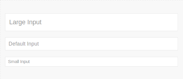
You can use the above classes simply as below-
Example:
<form> <div class="uk-margin"> <input class="uk-input uk-form-large" type="text" placeholder="Large Input"> </div> <div class="uk-margin"> <input class="uk-input" type="text" placeholder="Default Input"> </div> <div class="uk-margin"> <input class="uk-input uk-form-small" type="text" placeholder="Small Inuput"> </div> </form> |
If you run the above example it will produce the output something like this-
Width Modifiers
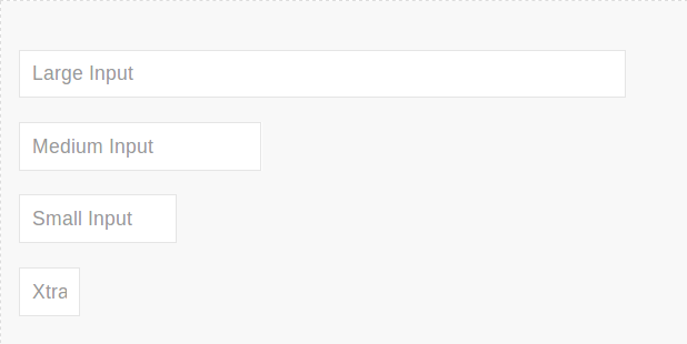
Using with modifiers we can create large, medium, small and extra small elements. You can modify width of input, select, textarea or other elements using this modifier. Here is an example of width modifier.
Example:
<form> <div class="uk-margin"> <input class="uk-input uk-form-width-large" type="text" placeholder="Large Input"> </div> <div class="uk-margin"> <input class="uk-input uk-form-width-medium" type="text" placeholder="Medium Input" > </div> <div class="uk-margin"> <input class="uk-input uk-form-width-small" type="text" placeholder="Small Input"> </div> <div class="uk-margin"> <input class="uk-input uk-form-width-xsmall" type="text" placeholder="Xtra Small Input"> </div> </form> |
If you run the above example it will produce output something like this-
Layout Controls | Horizontal | Vertical Form
You can add labels, controls to stacked or horizontal layout.
| Class | Description |
|---|---|
| .uk-form-stacked | This is used to display lables top of controls. |
| .uk-form-horizontal | This is used to display the labels & controls side by side. |
| .uk-form-label | This is used to define the label. |
| .uk-form-controls | Define the form controls. |
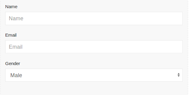
Vertical Form | Stacked Form
Class .uk-form-stacked is used to create stacked form.
Example:
<form class="uk-form-stacked">

    <div class="uk-margin">
        <label class="uk-form-label" for="form-stacked-text">Name</label>
        <div class="uk-form-controls">
            <input class="uk-input" id="form-stacked-text" type="text" placeholder="Name">
        </div>
    </div>
	<div class="uk-margin">
        <label class="uk-form-label" for="form-stacked-text">Email</label>
        <div class="uk-form-controls">
            <input class="uk-input" id="form-stacked-text" type="text" placeholder="Email">
        </div>
    </div>

    <div class="uk-margin">
        <label class="uk-form-label" for="form-stacked-select">Gender</label>
        <div class="uk-form-controls">
            <select class="uk-select" id="form-stacked-select">
                <option>Male</option>
                <option>Female</option>
            </select>
        </div>
    </div>

</form>
|
If you run the above example it will produce output something like this-
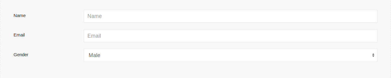
Horizontal Form
Add class uk-form-horizontal to create horizontal form in UIkit. Here is an example of horizontal form.
Example:
<form class="uk-form-horizontal">

    <div class="uk-margin">
        <label class="uk-form-label" for="form-horizontal-text">Name</label>
        <div class="uk-form-controls">
            <input class="uk-input" id="form-horizontal-text" type="text" placeholder="Name">
        </div>
    </div>
	<div class="uk-margin">
        <label class="uk-form-label" for="form-horizontal-text">Email</label>
        <div class="uk-form-controls">
            <input class="uk-input" id="form-horizontal-text" type="text" placeholder="Email">
        </div>
    </div>

    <div class="uk-margin">
        <label class="uk-form-label" for="form-horizontal-select">Gender</label>
        <div class="uk-form-controls">
            <select class="uk-select" id="form-horizontal-select">
                <option>Male</option>
                <option>Female</option>
            </select>
        </div>
    </div>

</form>
|
Output of above example-
Add Icon To Input
You can add icons simply as below-
<div class="uk-inline">
    <span class="uk-form-icon" uk-icon="icon: user"></span>
    <input class="uk-input">
</div>
Custom Controls
You can create custom controls such as file, select dropdown box.
File
You can create custom select upload box simply as below-
<form>
   <div class="uk-margin">
        <span class="uk-text-middle">Upload File</span>
        <div uk-form-custom>
            <input type="file">
            <span class="uk-link">upload</span>
        </div>
    </div>

</form>
Select Dropdown Box
You can replace the default select dropdown by uikit design simply as below-
 <div class="uk-margin">
        <div uk-form-custom="target: true">
            <select>
                <option value="1">Option 01</option>
                <option value="2">Option 02</option>
                <option value="3">Option 03</option>
            </select>
            <span></span>
        </div>
    </div>
Advertisements
Add Comment
📖 Read More
- 1. UIkit Table
- 2. UIkit List
- 3. UIkit Pagination
- 4. UIkit Progress Bar
- 5. UIkit Spinner
- 6. UIkit Divider
- 7. UIkit Totop scroll
- 8. UIkit Tile
- 9. UIkit Notification
- 10. UIkit Tab


