UIkit Alert
UIkit Alert– UIkit uk-alert component is used to create alert messages such as success, warning and error. It is very simple to use this component. Here in this article we are going to explain how to use alert component in UIkit.
UIkit Alert Component Example
There are following Types of Alert boxes available in UIkit-
- Primary
- Success
- Warning
- Danger
Add uk-alert attribute to block element to create alert messages.-
If you run the above example it will produce the output something like this-

Close Button
Add class uk-alert-close and attribute uk-close to create close button.
<div uk-alert>
    <a class="uk-alert-close" uk-close></a>
</div>
Primary Alert
Add class uk-alert-primary along with attribute uk-alert.
Primary Alert Example:
<div class="uk-alert-primary" uk-alert>
    <a class="uk-alert-close" uk-close></a>
    <p>Primary Alert Example.</p>
</div>
|
If You run the above example it will produce the output something like this-

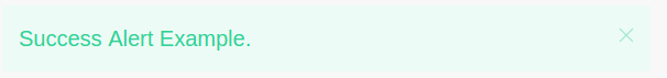
Success Alert
Add class uk-alert-success along with attribute uk-alert.
Primary Alert Example:
<div class="uk-alert-success" uk-alert>
    <a class="uk-alert-close" uk-close></a>
    <p>Success Alert Example.</p>
</div>
|
Output of above example will be-
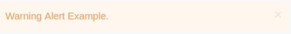
Warning Alert
Add class uk-alert-warning along with attribute uk-alert.
Warning Alert Example:
<div class="uk-alert-success" uk-alert>
    <a class="uk-alert-close" uk-close></a>
    <p>Warning Alert Example.</p>
</div>
|
Output of above example will be-
Danger Alert
Add class uk-alert-danger along with attribute uk-alert.
Danger Alert Example:
<div class="uk-alert-success" uk-alert>
    <a class="uk-alert-close" uk-close></a>
    <p>Danger Alert Example.</p>
</div>
|
Output of above example will be-

Component Options
| Option | Value | Default | Description |
|---|---|---|---|
animation |
Boolean, String | true |
Fade out. |
duration |
Number | 150 |
Animation duration in milliseconds. |
sel-close |
CSS selector | .uk-alert-close |
The close trigger element. |
JavaScript
Initialization
UIkit.alert(element, options);
Events
- beforehide– This event fires before hide.
- hide– Fires when an item is hidden.
Methods
Following methods are available-
Close
UIkit.alert(element).close();
Advertisements
Add Comment
📖 Read More
- 1. UIkit Align
- 2. UIkit Article
- 3. UIkit Badge
- 4. UIkit Breadcrumb
- 5. UIkit Button
- 6. UIkit Card
- 7. UIkit Form
- 8. UIkit Table
- 9. UIkit List
- 10. UIkit Pagination


