Ionic Cards
Ionic Cards : Ionic cards are great way to display information in an organized way. Cards are used widely by the companies like google, twitter. Cards can be any size and animated. Cards can be swiped left or right. You can add shadow and border to the ionic cards. Class “card” is used to create ionic cards. Here we are going to explain the card functionality with example and demo.
Ionic Cards
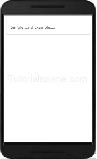
Add the class .card in wrapper div and then add child elements. Here is simple example of ionic cards.
Ionic Cards Example
<div class="card">
  <div class="item item-text-wrap">
    Simple Card Example.....
  </div>
</div>
|
The above example will produce the following output-
Headers And Footers
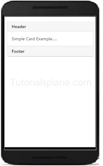
Headers and Footers are important part of ionic Cards. You can add Headers and footers by adding the class – .item-divider in header and footer. Example of header is as –
Cards Header And Footer Example
<div class="card">
<div class="item item-divider">
Header
</div>
  <div class="item item-text-wrap">
    Simple Card Example.....
  </div>
<div class="item item-divider">
Footer
</div>
</div>
|
The above example will produce the following output-
Ionic Cards With List
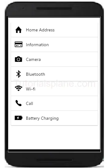
The class – .list is used to create cards with list. Example of card list is as –
Cards List Example
<div class="list card">
 <a href="#" class="item item-icon-left">
    <i class="icon ion-home"></i>
    Home Address
  </a>
  <a href="#" class="item item-icon-left">
    <i class="icon ion-card"></i>
    Information
  </a>
<a href="#" class="item item-icon-left">
    <i class="icon ion-alarm"></i>
    Alarm
  </a>
<a href="#" class="item item-icon-left">
    <i class="icon ion-alarm"></i>
     Basket
  </a>
<a href="#" class="item item-icon-left">
    <i class="icon battery-charging"></i>
     Battery Charging
  </a>
</div>
|
The above example will produce the following output-
Ionic Card Images
Cards are perfect to display images and content. Images in cards looks great. Here is an example card image-
Cards Image Example
<div class="list card">
 <div class="item item-avatar">
    <img src="//tutorialsplane.com/runtest/ionic/img/profile.jpg">
    <h2>John Doe</h2>
    <p>This is John From Australia...</p>
  </div>

  <div class="item item-image">
    <img src="//tutorialsplane.com/runtest/ionic/img/cover.jpg">
  </div>
</div>
|
The above example will produce the following output-

Card Showcase
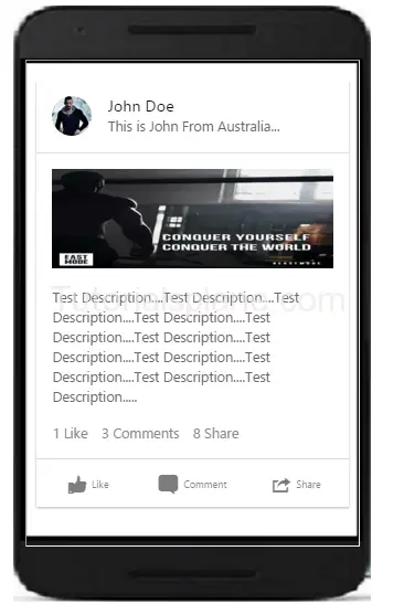
Card Showcase contains several items such as item-avatar, item-card, images and item-body etc. Card Showcase are great way to display the rich content. Here is example of Card Showcase-
Card Showcase Example
<div class="list card">
 <div class="item item-avatar">
    <img src="//tutorialsplane.com/runtest/ionic/img/profile.jpg">
    <h2>John Doe</h2>
    <p>This is John From Australia...</p>
  </div>
<div class="item item-body">

    <img class="full-image" src="//tutorialsplane.com/runtest/ionic/img/cover.jpg">
    <p>Test Description....Test Description....Test Description....Test Description....Test Description....Test Description....Test Description....Test Description....Test Description....Test Description....Test Description.....</p>
    <p>
      <a href="#" class="subdued">1 Like</a>
      <a href="#" class="subdued">3 Comments</a>
      <a href="#" class="subdued">8 Share</a>
    </p>

</div>
<div class="item tabs tabs-secondary tabs-icon-left">
    <a class="tab-item" href="#">
      <i class="icon ion-thumbsup"></i>
      Like
    </a>
    <a class="tab-item" href="#">
      <i class="icon ion-chatbox"></i>
      Comment
    </a>
    <a class="tab-item" href="#">
      <i class="icon ion-share"></i>
      Share
    </a>
  </div>
</div>
|
The above example will produce the following output-
Advertisements
Add Comment
📖 Read More
- 1. Ionic Form
- 2. Ionic Toggle
- 3. Ionic Checkbox
- 4. Ionic Radio Button
- 5. Ionic Range
- 6. Ionic Select
- 7. Ionic Tabs
- 8. Ionic Grid
- 9. Ionic Colors
- 10. Ionic Icons

