Tutorialsplane.com
Tutorialsplane is the world's largest learning website..you can get interesting article with example and demo.
UIkit Table– Class uk-tableis used to create table in UIkit framework. You can use predefined classes to create beautiful tables in UIkit framework. Here in this article we are going to explain how you can create tables in UIkit with different-different styles.
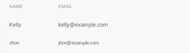
Add class uk-table to table. Here is simple example of UIkit table. –
If you run the above example it will produce the output something like this-
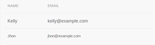
Add class uk-table-divider to add divider between table rows.
If you run the above example it will produce output something like this-
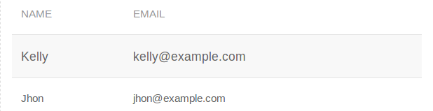
Add class uk-table-striped to create striped table row.
If you run the above example it will produce the output something like this-
If you want to add the hover effect on table rows add class uk-table-hover to table.
To make table responsive add class uk-overflow-auto to div wrapper and add table inside it. Table will be automatically responsive on all devices.
|
UIkit Form– UIkit provides classes to create beautiful form with different styles. Here in this article we are going to explain how you can use pre defined classes to create form elements. You can also use our online editor to edit and run the code online.
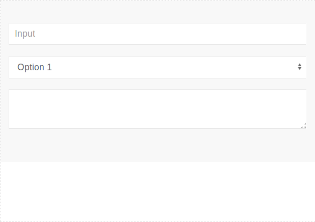
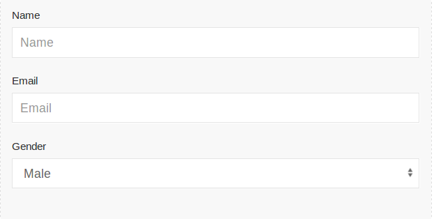
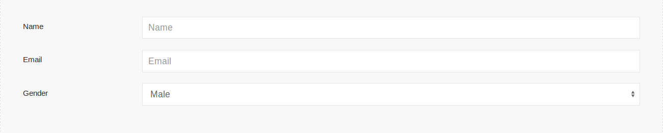
Let us create a simple form with basic elements.
If you run the above example it will produce output something like this-
Following classes are available which you can use to create form elements.
| Name | Class | Description |
|---|---|---|
| Input | .uk-input | This is input class, add to <input> elements. |
| Select Box | .uk-select | This is select class, add this to <select> elements. |
| Textarea | .uk-textarea | This is textarea class, add this to <textarea> elements. |
| Radio Button | .uk-radio | This is radio button class, add this to <input type=”radio”> elements. |
| Checkbox | .uk-checkbox | This class is used to create checkboxes, Add this class to <input type=”checkbox”> elements. |
| Range | .uk-range | This class is used to create range element add this to range element <input type=”range”>. |
Following state modifier classes are available-
| Class | Description |
|---|---|
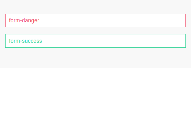
| .uk-form-danger | This is used to represent the danger state such as error message. |
| .uk-form-success | This is used to reresent that action has been successfully performed. |
Now let us create a simple example.
If you run the above example it will produce output something like this-
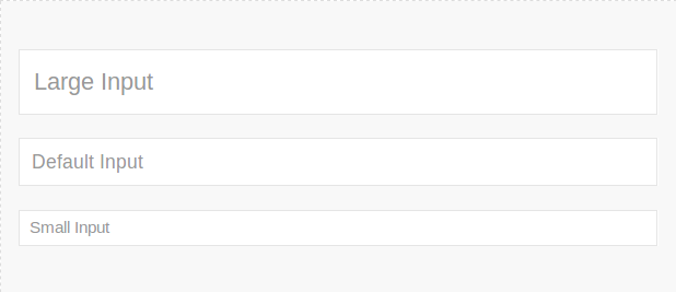
You can change the size of form elements using the following modifiers-
| Class | Description |
|---|---|
| .uk-form-large | This is used to create large elements. |
| .uk-form-small | This is used to create small elements. |
You can use the above classes simply as below-
If you run the above example it will produce the output something like this-
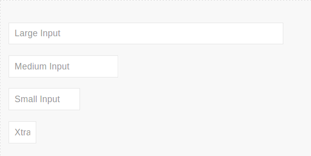
Using with modifiers we can create large, medium, small and extra small elements. You can modify width of input, select, textarea or other elements using this modifier. Here is an example of width modifier.
If you run the above example it will produce output something like this-
You can add labels, controls to stacked or horizontal layout.
| Class | Description |
|---|---|
| .uk-form-stacked | This is used to display lables top of controls. |
| .uk-form-horizontal | This is used to display the labels & controls side by side. |
| .uk-form-label | This is used to define the label. |
| .uk-form-controls | Define the form controls. |
Class .uk-form-stacked is used to create stacked form.
If you run the above example it will produce output something like this-
Add class uk-form-horizontal to create horizontal form in UIkit. Here is an example of horizontal form.
Output of above example-
You can add icons simply as below-
You can create custom controls such as file, select dropdown box.
You can create custom select upload box simply as below-
You can replace the default select dropdown by uikit design simply as below-
UIkit Card– You can create layout boxes using card classes in beautiful styles. Class uk-card is used to create cards in UIkit framework. Here in this article we are going to explain how you can use the card classes and modifier classes to create beautiful cards.
Following classes are used to define a card in UIKit-
| Class | Description |
|---|---|
.uk-card |
This class is used to define the Card component. |
.uk-card-body |
This class defines the body of card. |
.uk-card-title |
This is used to define the card title. |
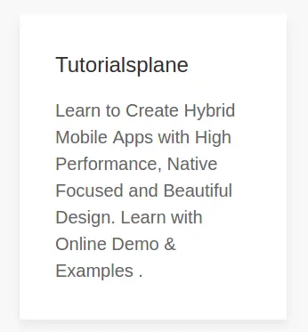
Let us create a simple example.
|
If you run the above example it will produce output something like this-
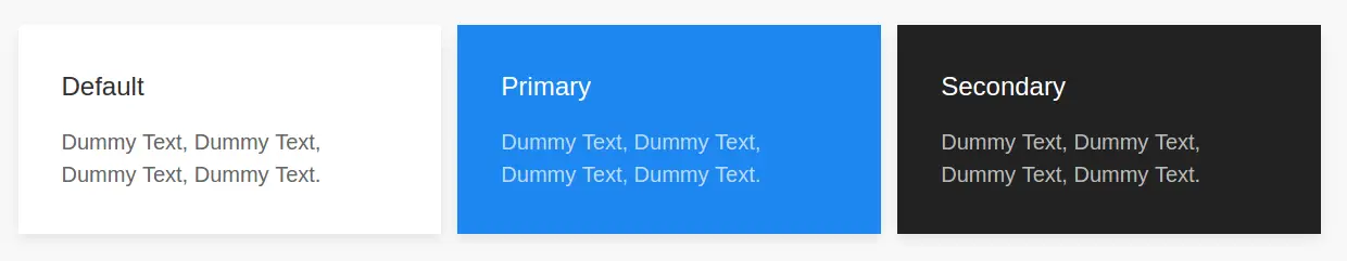
Following modifier classes are available-
|
If you run the above example it will produce output like this-
You can use the following size modifiers to changes the size of cards.
Class uk-card-header and uk-card-footer is used to add the header and footer of card.
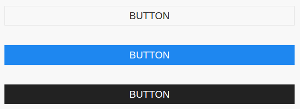
UIkit Button UIkit provides classes to create beautiful buttons. You can create various type of buttons using predefined classes. Here in this article we are going to explain how to create UIkit buttons.
To create a button add class .uk-button and modifier class uk-button-default.-

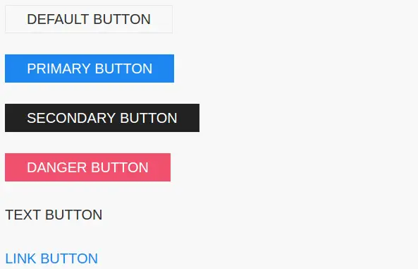
Following style modifiers are available which we can use to create beautiful buttons.
| Button | Class | Description |
|---|---|---|
| Default Button | .uk-button-default | Default button style. |
| Primary Button | .uk-button-primary | Creates Primary Button. |
| Secondry Button | .uk-button-secondary | Creates Secondary Button. |
| Danger Button | .uk-button-danger | Creates a danger button. |
| Text Button | .uk-button-text | Applies an alternative, typographic style. |
| Link Button | .uk-button-link | Creates a link button. |
Let us create an example to understand the above modifiers.
If you run the above example it will produce output something like this-
You can use following size modifiers to change the button size.
If you the above example it will produce the output something like this-

You can use width modifiers to create block level buttons. Add class uk-width-1-1 to make button full width.
Output of above example-
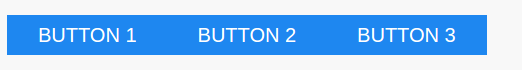
Add a div wrapper with class uk-button-group to create button groups.
You can create buttons with dropdown in UIkit framework using predefined classes. Here is an example of dropdown button with nav header and nav divider.
UIkit Breadcrumb– Breadcrumb is basically used to represent the user location on website. Class .uk-breadcrumb is used to create breadcrumb. Here in this article we are going to explain how to use this class. You can also use our online editor to edit and run the code online.
Add class uk-breadcrumb to <ul> and add <li> and <a>. If you want to show active link item replace <a> by <span>. Here is simple example of breadcrumb –
If you run the above example it will produce the output something like this-
Replace <a> by <span> to make an item active.
Add class uk-disabled to <li> make disabled breadcrumb.
UIkit Badge: Class uk-badge is used to create badge in UIkit framework. Here in this article, we are going to explain how to create badge icons in UIkit framework. You can also use our online editor to edit and run the code.
Add class uk-badge to element to create a badge. Here is an example-
If you run the above example it will produce the output something like this-
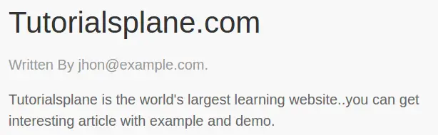
UIkit Article– UIkit provides classes to create articles which contains- title and metadata. Here in this tutorial, we are going to explain how you can create Articles in UIkit framework.
Class uk-article is used to define the article body,uk-article-title is used to add the title of article, uk-article-meta is used to add the meta information. Here is simple example of article-
|
If you run the above example it will produce output something like this.
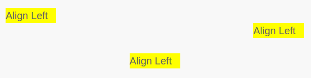
UIkit Align– This component allows us to control the alignment of elements. Here in this tutorial, we are going to explain how to align elements in UIkit. You can also use online editor to edit and run the code online.
You can use following classes to align Text/Element/Image in UIkit-
Here is an example of alignment classes
If you run the above example it will produce the output something like this-
Following responsive classes are available which will work on Only specific devices.
| Class | Description |
|---|---|
| .uk-align-left@s .uk-align-right@s |
Apply only device of width 640px and higher. |
| .uk-align-left@m .uk-align-right@m |
Apply only device of width 960px and higher. |
.uk-align-right@l |
Apply only device of width1200px and higher. |
| .uk-align-left@xl .uk-align-right@xl |
Apply only device of width 1600px and higher. |
UIkit Alert– UIkit uk-alert component is used to create alert messages such as success, warning and error. It is very simple to use this component. Here in this article we are going to explain how to use alert component in UIkit.
There are following Types of Alert boxes available in UIkit-
Add uk-alert attribute to block element to create alert messages.-
If you run the above example it will produce the output something like this-

Add class uk-alert-close and attribute uk-close to create close button.
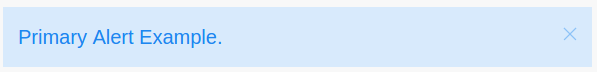
Add class uk-alert-primary along with attribute uk-alert.
If You run the above example it will produce the output something like this-
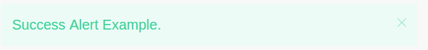
Add class uk-alert-success along with attribute uk-alert.
Output of above example will be-
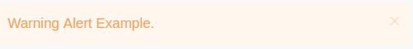
Add class uk-alert-warning along with attribute uk-alert.
Output of above example will be-
Add class uk-alert-danger along with attribute uk-alert.
Output of above example will be-

| Option | Value | Default | Description |
|---|---|---|---|
animation |
Boolean, String | true |
Fade out. |
duration |
Number | 150 |
Animation duration in milliseconds. |
sel-close |
CSS selector | .uk-alert-close |
The close trigger element. |
Initialization
UIkit.alert(element, options);
Following methods are available-
UIkit.alert(element).close();


