Category Archives: UIkit
UIkit Tab
UIkit tab– This component allows us to create the tabs in UIkit framework. This component contains tabs aligned in single row that are clickable. Here in this article, we are going to explain how to create tabs in UIkit framework. You can also our online editor to edit and run the code online.
UIkit Tab Component Syntax & Example
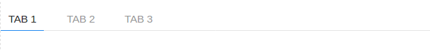
Let us first create simple UIkit Tab-
If you run the above example it will produce output something like this-
Following classes and attribute are used to create tabs in UIkit.
| Class/Attribute | Description |
|---|---|
| uk-tab | Add attribute uk-tab to <ul> and then add <a> elements as tab items within the list. |
| .uk-active | This represents active state. |
| .uk-disabled | This represents disabled state. |
Bottom Modifier
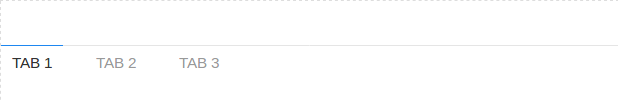
Class uk-tab-bottom is used to add the tab bottom
- ...
If you run the above example it will produce output like this-
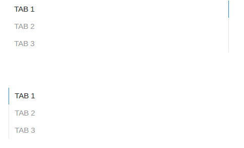
Left | Right Modifiers
You can use class uk-tab-left and uk-tab-left to create vertical tabs. Class uk-tab-left is used to place the divider to left and uk-tab-right is used to place the divider right of tabs.
If you run the above example it will produce output something like this-
UIkit Notification
UIkit Notification This component allows us to create notifications in UIkit framework. JavaScript Api UIkit.notification is available to show notification on page.
UIkit Notification Example
Syntax
UIkit.notification({
    message: 'Your Message!',
    status: 'primary',
    pos: 'top-right',
    timeout: 5000
});
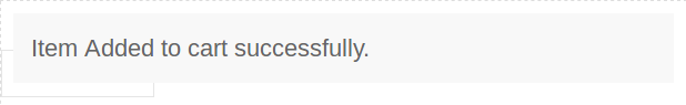
Let us first create a very basic notification in UIkit. –
Output of above example-
Show Html Message
Sometimes we need to display html messages in notification, you can display html message simply as below-
Close All Notification
If you want to close all notification, you can use the below method.
UIkit.notification.closeAll();
Options
| Option | Value | Default | Description |
|---|---|---|---|
| message | String | false | Notification message to be displayed. |
| status | String | null | Color of notification status, this can be primary, warning, success, danger. |
| timeout | Integer | 5000 | Visibility duration until a notification disappears. |
| group | String | null | Use if you want to disable in specific group. |
| pos | String | top-center, top-left, top-right, bottom-center, bottom-left, bottom-right | Display corner. |
UIkit Tile
UIkit Tile– Tiles are basically layout boxes which can be arranged side by side. UIkit provides classes to create beautiful tiles with different-different styles and sizes.
UIkit Tile Example
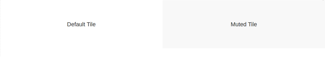
Class uk-tile is used to define the tile body. By default tile looks like blank container so add modifier classes such as uk-tile-default. Here is simple example of UIkit tile.
If you run the above example it will produce output like this-
Background Modifier
Following background modifier classes are available-
| Class | Description |
|---|---|
| .uk-tile-default | Adds default tile background. |
| .uk-tile-muted | Adds muted tile background. |
| .uk-tile-primary | Adds primary tile background. |
| .uk-tile-secondary | Adds secondary tile background. |
Add Padding
You can use the following padding classes to manage the tile padding-
| Class | Description |
|---|---|
| .uk-padding | Adds default padding. |
| .uk-padding-small | Adds small padding. |
| .uk-padding-large | Adds large padding. |
UIkit Totop scroll
UIkit Totop scroll– This component allows you to create a button which provides functionality to scroll to top when you click on it. It is very simple to create to top scroller, just add attribute uk-totop to button then everything will be automatically taken care by UIkit.
UIkit Totop scroll Example
To create scroll to top functionality on button click event add attribute uk-totop to button simply as below –
If you run the above example it will produce output something like this-

UIkit Divider
UIkit Divider– Dividers are basically used to separate content. UIkit provides default separator as <hr> tag with beautiful style. Here in this tutorial, we are going to explain how you can use divider in UIkit.
UIkit Divider Component | Class | Example
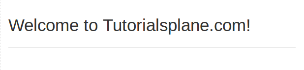
Use <hr> tag to add separator between the contents. <hr> tag comes with default divider functionality. –
Output of above example-
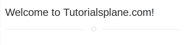
Add Divider Icon
Add class uk-divider-icon to hr tag for adding the icon in divider.
Output of above example-
Small Divider
Add class uk-divider-small to create small divider.
Output of above example-
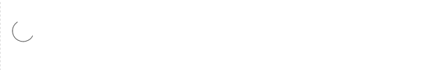
UIkit Spinner
UIkit Spinner– Attribute uk-spinner is used to create the animated spinner in UIkit framework.
UIkit Spinner Example
Add attribute uk-spinner to div element to create spinner. –
If you run the above example it will produce the output something like this-
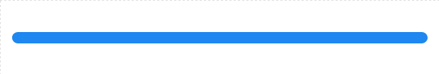
UIkit Progress Bar
UIkit Progress Bar– To create progress bar add class uk-progress to <progress> element.
UIkit Progress Bar Example
Syntax for Progress bar-
Syntax:
|
|
Where value is progress bar value and max is the maximum allowed value for progress bar.
Example
Let us create a simple example using JavaScript.
If you run the above example it will produce output something like this-
UIkit Pagination
UIkit Pagination Pagination component allows us to create beautiful pagination. Class uk-pagination is used to create pagination in UIkit. Here in this article we are going to explain how to create pagination in UIkit.
UIkit Pagination Example
Pagination basically provides navigation links in button style that are horizontally aligned. Let us create very first navigation link.
If you run the above example it will produce output something like this-
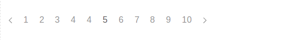
Active & Disabled Links
- uk-active– Add this class to show the active state.
- uk-disabled– Add this class to show disabled state.
Syntax
Previous & Next Button
Class uk-pagination-previous is used to create previous button and uk-pagination-next is used to create next button in UIkit Pagination.
UIkit List
UIkit List– Class uk-list is used to create the beautiful list in Uikit framework. Add class uk-list to create basic list with simple style. Here in this tutorial, we are going to explain how you can create lists in UIkit css framework.
UIkit List Example
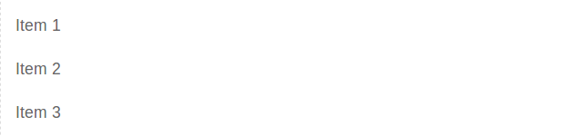
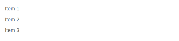
Let us create very first simple list-
If you run the above example it will produce output something like this-
Bullet Modifier
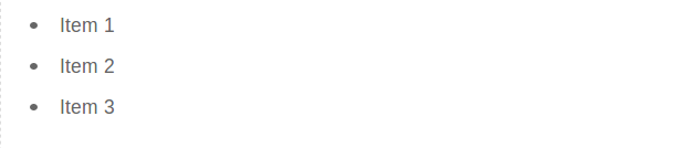
To create bullet list items add class uk-list-bullet. Here is an example.
If you run the above example it will produce the output something like this-
Divider Modifier
Add class uk-list-divider to create separator between list items.
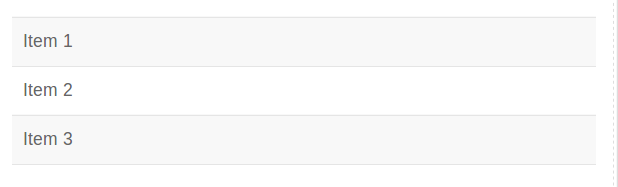
Striped Modifier
Add class uk-list-striped to create striped modifiers.
Large Modifier
Add class uk-list-large to increase the gaps between the list items.
If you run the above example it will produce output something like this-