Category Archives: Materialized
Materialize Breadcrumb
Materialize Breadcrumb Breadcrumbs are basically used to display the current location. In this tutorial we are going to explain how you can create breadcrumbs in Materialize framework.
You can also use our online editor to edit and run the code online.
Materialize Breadcrumb Example
Class nav-wrapper and breadcrumb is used to create Breadcrumb in Materialize. Here is a simple example of Breadcrumb-
In the above example we have created a simple breadcrumb with the current location “codeigniter”, which means you are on codeigniter page and it is under PHP category and Home points home page.
If you run the above example it will produce the output something like this –

Materialize Buttons
Materialize Buttons: Materialize Provides the inbuilt classes to create different buttons with effects. It is very simple to create buttons in Materialize framework. Here in this tutorial we are going to explain how you can create buttons in Materialize framework. You can also use our online editor to edit and
run the code online.
Materialize Buttons Example
There are following types of Buttons Available in Materialize-
- →Raised
- →Floating
There are basically four types of floating buttons –
1. Fixed Action
2. Horizontal FAB
3. Click Only FAB
4. Toolbar FAB - →Flat
- →Submit
- →Large
- →Disabled
Let us go one by one to understand the above button types.
Raised Button
You can create Raised Button simply as below –
If you will run the above example it will produce the output something like this –

Floating Button
Class btn-floating is used to create floating button in Materialize. Here is an example of floating button –
If you run the above example it will produce the following output –

Fixed Action Button
You can create fixed action which can contain multiple action that will appear on hover-
Materialize Floating Action Button Example:
|
|
If you run the above example it will produce the output something like this –
![]()
Horizontal Fab
Class horizontal is used to create horizontal fab button. You can create Horizontal Fab simply as below –
Materialize Horizontal Fab Button Example:
|
|
If you run the above example it will produce the output something like this –

Click Only Fab
If you want to open the option only on click, add the class click-to-toggle simply as below –
Materialize Click Only Fab Button Example:
|
|
Fab To Toolbar
To create Fab toolbar add class toolbar to the fab. Here is an example of fab toolbar-
If you run the above example it will produce the output something like this –

Flat Button
Class btn-flat is used to create Flat button in Materialize. Here is an example of flat Button –
Submit Button
Disabled Button
Class disabled is used to create disabled button in materialize.
If you run the above example it will produce output something like this –
![]()
Materialize Badges
Materialize Badges : Badges are basically used to show the notifications or unread messages. Materialize provides inbuilt classes to show Badges. Here in this tutorial we are going to explain how you can use badges in Materialize framework. You can also use our online demo edit and run the code online.
Materialize Badges Example
Let us go step by step to understand the badges-
Add Badges To Collections
Class badge is used to create badge and class new badge is used to add background to the badges. Here is an example to add badges in collections simply as below –
If you run the above example it will produce output something like this –

Add Badges To Dropdown
You can add badges to dropdown menu simply as below –
If you run the above example it will produce output something like this –

Add Badges To Navbar
If you run the above example it will produce output something like this –

Add Badges To Collapsibles
You can add badges to collapsibles simply as below –
Materialize Add badges to Collapsibles:
|
If you run the above example it will produce output something like this –

Learn More
Let us have some More example and demo about the Angular Material Chips.
Custom Captions
Add Custom Color
If you want to add color to the badges you can add simply as below –
The above example will give output something like this –
![]()
Materialize Typography
Materialize Typography Roboto 2.0 standard font is used in Materialize framework. Here in this tutorial we are going to explain headings, blockquotes and free-flow text. You can also use our online demo to edit and run the code online.
Materialize Typography
Sometimes we do not need the default Roboto font so we need to override/remove the default Roboto font. You can remove the roboto font simply as below –
Remove | Override Roboto
[su_divider top=”no” size=”2″ margin=”5″]
You can remove the roboto the simple css as –
Materialize Typography | Remove | Override Roboto | Example:
html {
    font-family: GillSans, Calibri, Trebuchet, sans-serif;
  }
|
Headings
[su_divider top=”no” size=”2″ margin=”5″]
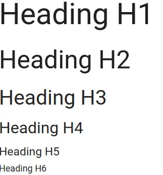
Materialize provides basic styling for the headings. There are following heading styles available –
Materialize Headings | Example:
|
If you run the above example it will produce output something like this –
Blockquotes
[su_divider top=”no” size=”2″ margin=”5″]
Blockquotes gives emphasis to a quote or citation. Here is an example of blockquote in Materialize-
If you run the above example it will produce output something like this –
![]()
Flow Text
[su_divider top=”no” size=”2″ margin=”5″]
Add the class flow-text to the body of text as in the example given below –
Materialize Flow Text Example:
|
Materialize Table
Materialize Table Materialize Provides Utility Classes to create tables, Using these classes we can create beautiful tabales. Here in this tutorial we are going to explain how to create different-different tables using these classes. You can also use our online editor to edit and run the code online.
Materialize Table Example
You can use the utility classes to create following tables-
Borderless Table
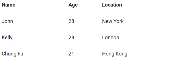
By Default Tables in Materialize Framework are borderless. If you do not Add any class to the table then it will be borderless table. Here is an example of borderless table-
How to create Borderless Table in Materialize ?
|
If you run the above example it will produce output something like this –
Bordered Table
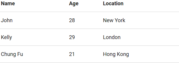
To create Bordered Table add class bordered to the table tag. Here is an example of bordered table –
How to create Bordered Table in Materialize ?
|
If you run the above example it will produce output something like this –
Striped Table
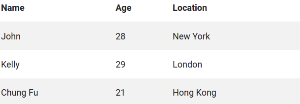
To create Striped Table add class striped to the table tag. Here is an example of Striped table –
How to create Striped Table in Materialize ?
|
If you run the above example it will produce the output something like this –
Highlight Table
To create Highlight(ie. change row background on hover) Table add class highlight to the table tag. Here is an example of Highlight table –
How to create Highlight Table in Materialize ?
|
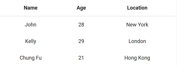
Centered Table
To create Centered Table add class centered to the table tag. Here is an example of Centered table –
How to create Centered Table in Materialize ?
|
If you run the above example it will produce the output something like this –
Responsive Table
To create Responsive Table add class responsive-table to the table tag. Here is an example of Responsive table –
How to create Responsive Table in Materialize ?
|
Responsive table will be scrollable on smaller screens.
Materialize Shadow
Materialize Shadow : Materialize Provides Various Shadow classes to Add the Shadow effect in the element. Here in this tutorial we are going to explain how you can Add shadow to the elements with example & demo.
Materialize Shadow Example
Here is list of Classes Available To Add Shadows-
- z-depth-1: This Adds 1px border and z-depth 1.
- z-depth-2: This Adds 2px border and z-depth 2.
- z-depth-3: This Adds 3px border and z-depth 3.
- z-depth-4: This Adds 4px border and z-depth 4.
- z-depth-5: This Adds 5px border and z-depth 5.
- z-depth-0: This is used to remove shadows from the element that have z-depths defaults.
Box Shadow Example
Let us create an example to understand the box Shadow in Materialize framework.
If you run the above example it will produce output something like this –

Materialize Media
Materialize Media– Materialize provides classes for displaying media content. Here in this tutorial we are going to explain how you can use media classes in MaterializeCSS to manage the media content. You can also use our online editor to edit and run the code online. You can also watch video tutorial for media content tutorial.
Materialize Media Example
Images
Images can be styled in following ways-
Responsive Images
To create responsive images you need to add the class responsive-img to the image tag which will make image responsive-
Circular Images
To make image circular just add circle class to the image tag.
If you run the above example it will produce output something like this –

Videos
You can embed the videos in page using responsive-video and video-container class.
Responsive Embed
If you want to embed videos such as youtube videos you can embed videos simply as below which will be responsive on all devices.
Responsive Videos
You can make html videos responsive by simply adding the class responsive-video
Materialize Media | Responsive Video Html 5 Example:
|
|
Materialize Helpers
Materialize Helpers : Materialize Provides inbuilt classes which fulfills the common and frequent tasks such as alignment, float, formatting, hover etc. Here in this tutorial we are going to explain how you can use these predefined classes. You can also use our online editor to edit and run the code online.
Materialize Helpers Example
Following helper classes are available-
- Alignment Classes
- Float Classses
- Hiding Content Classes
- Formatting Class
- Hover Class
- Browser Defaults Class
Alignment Classes
There are following alignment classes in Materialize-
- Vertical Align
- Text Align(Left Align, Right Align, Center Align)
Vertical Align
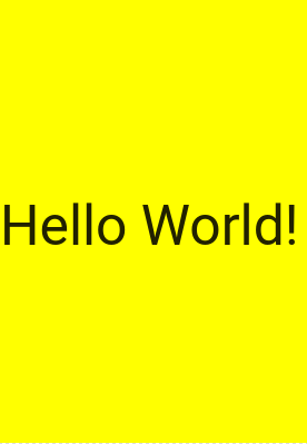
If you want to align the things vertically just add the class valign-wrapper to the container and valign class to the element you want to align vertically.
If You run the above example it will produce the output something like this –
Text Align
There are following three classes which can be used to align text horizontally-
- left-align : This class is used to left align the text.
- right-align : This class is used to right align the text.
- center-align : This class is used to center align the text.
Now let us create an example to understand this –
Materialize Helpers | Text Align | Left | Right | Center | Example:
|
If you run the above example it will produce the output something like this –

Float
There are basically two float classes available – left & right. You can use these classes to easily float the elements.
If you run the above example it will produce the output something like this –
![]()
Hiding Contents Classes
Sometimes we need to hide some content for all devices or some specific devices. Materialize provides inbuilt classes to hide content on several devices.
- .hide: Hide for all Devices
- .hide-on-small-only: Hide for Mobile Only
- .hide-on-med-only: Hide for Tablet Only
- .hide-on-med-and-down:Hide for Tablet and Below
- .hide-on-med-and-up:Hide for Tablet and Above
- .hide-on-large-only:Hide for Desktop Only
If you run the above example it will hide the div content on desktop.
Formatting
[su_divider top=”no” margin=”5″]
Materialize provides Formatting classes to format content.
- Truncation
- Hover
Truncation
This class is used to truncate the long text in an ellipsis.
If you run the above example it will produce the output something like this –

Hover
Materialize provides the hoverable class that adds the box shadow animation.
Browser Defaults
Some default styles are overridden in Materialize and sometimes we need default styles instead of overridden, so it provides browser-default class to revert the elements style to their original state.
Materialize Color
Materialize Color: Materialize provides rich predefined colors. These colors are based on Material Design base colors. Colors in Materialize are defined with a base color class and an optional class which can be used for lighten or darken. Here in this tutorial we are going to explain how you can use colors in using the predefined classes in Materialize.
Materialize Color Usage | Example
Let us go step by step to understand the colors in Materialize –
Background Color
You can add the background color just add the color name and lightness/brightness as the class to the element. Here is an example to add background color in Materialize.
If you run the above example it will produce the output something like this –

Text Color
To change text color you just need to append “-text” in color classes. Let us create an example to change the color of the text.
If you run the above example it will produce output something like this –
![]()
Colors
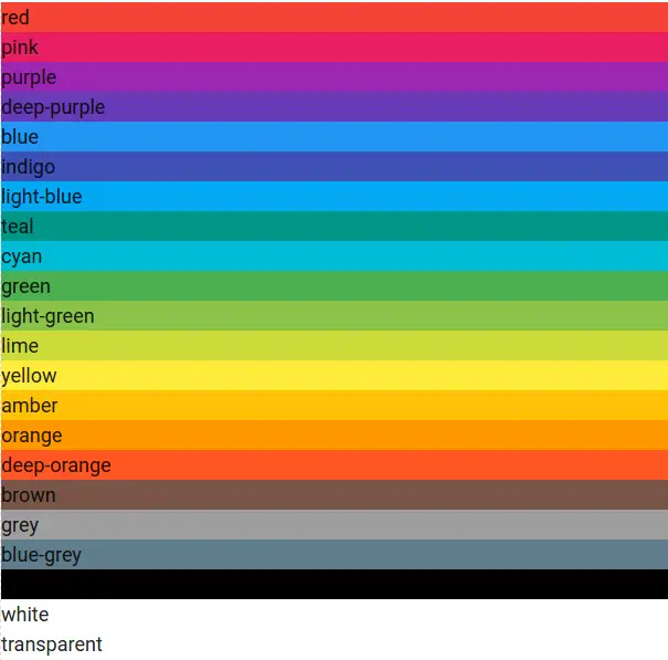
Following colors are available which you can use with lightness/darkness-
- red
- pink
- purple
- deep-purple
- blue
- indigo
- light-blue
- teal
- cyan
- green
- light-green
- lime
- yellow
- amber
- orange
- deep-orange
- brown
- grey
- blue-grey
- black
- white
- transparent
Lightness/Darkness
Following Lightness/Darkness classes Are available which can be used to apply darkness or lightness in color.
- lighten-1
- lighten-2
- lighten-3
- lighten-4
- lighten-5
- darken-1
- darken-2
- darken-3
- darken-4
- accent-1
- accent-2
- accent-3
- accent-4
Learn More
Let us have some more example and demo about the Materialize Colors.
Basic Colors
Let us create an example of basic colors listed above-
Materialize Add Background Color Example:
|
If you run the above example it will produce the output something like this –
Now let us Understand how lightness and darkness works.
Lightness/Darkness Example
Here let us pick one color let us say “blue” and add lightness/darkness classes to see how it works-
Materialize Lightness | Darkness Color Example:
|
If you run the above example it will produce the output something like this –


