Category Archives: ionic tutorial
Ionic Select
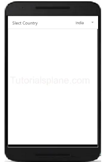
Ionic Select – Select in Ionic Provides the functionality to select option from dropdown. It will work different than the traditional select box in the browser. We are going to explain the functionality of the select with example and demo.
Ionic Select
Now let us create very simple select box in ionic. First wrap the select box with label and add the classes – .item, .item-input and .item-select. Now add div with class .input-label inside the created label to create label. Now add html select <select> and their options in <option> tag.
Ionic Range
Ionic Range Slider: Range Slider enables the user to select the range between the given points. Range slider provides disks to manage the range. There are various range selectors in Ionic which you can use in your application. It is very easy to customize the range slider. You can use classes to add the colors to the elements. We are going to explain the method how to use range sliders and how to customize them.
Ionic Range Slider Example | Color | Selector
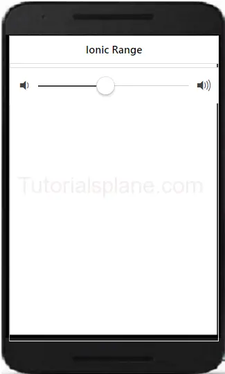
Let us understand the Range selector with very basic example –
If you run the above example it will produce the output like this –
More Examples
Let us learn more abot the ionic range. Here we are going to explain how to add different colors and icons.
Ionic Range List With Different Colors And Icons
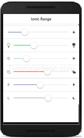
Here we are going to add different icons and colors in the range of ionic framework.
The above example will produce the following output-
Ionic Radio Button
Ionic Radio Button: Radio button are specially used to select one item from the given list. There is main difference between the radio buttons and checkbox – Checkbox allows you multiple selection of items in list while radio buttons allows you to select only one item in given list. We are going to explain the functionality of radio buttons in ionic framework.
Ionic Radio Button
Here is an example of radio button in ionic –
After running the above example it will produce the following output as bellow-
Ionic Checkbox
Ionic Checkbox: Checkbox is basically used for selecting items from the set of choice. Ionic provides classes to create beautiful checkboxes. A label wrapper with class checkbox is used to wrap the input checkbox. It will represent both the selected and unselected checkboxes in beautiful design. We are going to explain the ionic Checkboxes with example and online demo.
Ionic Checkbox Example
Here is simple example of ionic checkbox with shows both states of checkbox.
The above example produce the following output as below-
Ionic Multiple Checkboxes
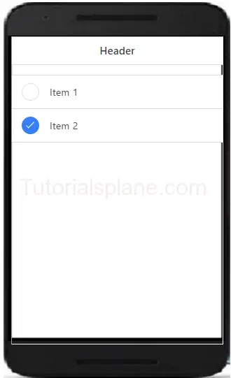
You can create multiple checkboxes in ionic. The li class .item-checkbox is used to create multiple checkboxes in ionic framwork.
The above example produce the following output as below-
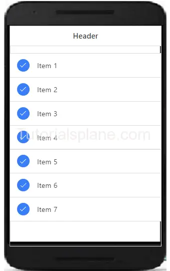
Ionic Colored Checkbox
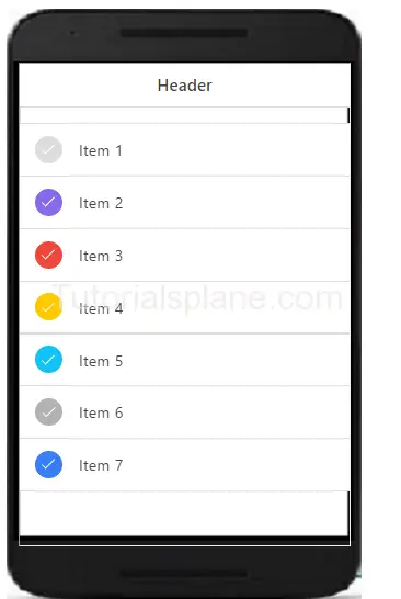
You can add colors to the ionic checkboxes using color classes available in ionic to create colored Checkboxes-
The above example produce the following output as below-
Ionic Toggle
Ionic Toggle – Toggle is functionality which enables users to select one option from two options. Ionic provides classes to create toggle in app which you can easily animate and decorate with ionic colors. Ionic toggle works as html input checkbox. Ionic toggles are beautiful you will definitely love it. We are going to implement the ionic toggle on the basis of the classes.
Ionic Toggle Example
Checkbox is wrapped with the label and class .toggle. Toggle contains the track div which create background and contains div with class .handle.
The above example will produce the following output-
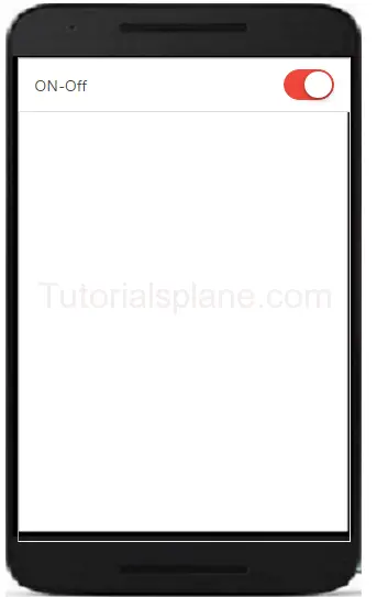
Ionic Mutiple Toggle Button In Colored Style
Let us have an example of html multiple toggles in colored style.
Ionic colored multiple toggle-
|
The above example will produce the following output-
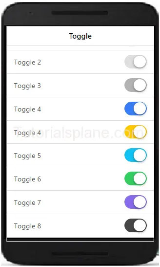
Ionic Form
Ionic Form – Form is also an important component of ionic. Ionic provides inbuilt form elements which can be used frequently. Class .list is used to wrap the form elements. Class .item and .item-input is used to input field’s label. Label tag contains the input field of the form. Here we are going to explain the HTML5 input elements.
It is very simple to create form and it’s input fields in Ionic framework. Here in this tutorial we are going to explain how you can create form in Ionic Framework. You can also use our online demo to see the output of the examples.
Ionic Form Syntax | Example | Demo
Let us go to understand form & it’s input fields. Here is simple example of Ionic Form, In this example we have simply create two input fields- name, email and submit button. –
If you run the above example it will produce the output something like this-
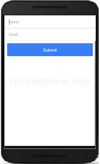
Text Input – Inline Label
You can add labels input label in ionic by adding the class input-label simply as in below example –
Text Input – Stacked Label
You can add Stacked input label in ionic by adding the class item-stacked-label –
Text Input – Floating Label
You can add Floating input label in ionic by adding the class item-floating-label –
Ionic Forms Inset Inputs
You can create inset forms by adding the class list-inset in wrapper div. Here is an example of form inset input –
Ionic Input Icons
Sometimes we need to add the icons to the form inputs, for this you don’t need to write any extra css, You can simply add icons in input fields by adding ion icon classes. Here is an example of input icons –
To the demo and see the output of the above code just hit the “try it” button.
If you run the above example it will produce the output with input icons field as below-
Ionic Cards
Ionic Cards : Ionic cards are great way to display information in an organized way. Cards are used widely by the companies like google, twitter. Cards can be any size and animated. Cards can be swiped left or right. You can add shadow and border to the ionic cards. Class “card” is used to create ionic cards. Here we are going to explain the card functionality with example and demo.
Ionic Cards
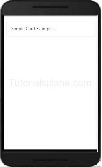
Add the class .card in wrapper div and then add child elements. Here is simple example of ionic cards.
The above example will produce the following output-
Headers And Footers
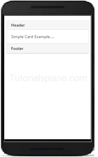
Headers and Footers are important part of ionic Cards. You can add Headers and footers by adding the class – .item-divider in header and footer. Example of header is as –
The above example will produce the following output-
Ionic Cards With List
The class – .list is used to create cards with list. Example of card list is as –
The above example will produce the following output-
Ionic Card Images
Cards are perfect to display images and content. Images in cards looks great. Here is an example card image-
The above example will produce the following output-

Card Showcase
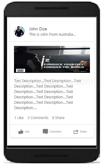
Card Showcase contains several items such as item-avatar, item-card, images and item-body etc. Card Showcase are great way to display the rich content. Here is example of Card Showcase-
Card Showcase Example
|
The above example will produce the following output-
Ionic List
Ionic List : Lists are used to display data in very simple format. It can be used to display data in various format. It can contain simple text to rich content icons, buttons, thumbnails and multimedia etc.
Ionic provides very powerful list components which supports various modes such as reorder, swap to edit etc. We are going to explain the ionic list with example and demo.
Ionic List
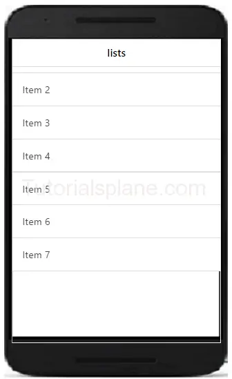
Class .list is used to create list in ionic. Here is very basic example of ionic list –
If you run the above example it will produce the following output-
Ionic List Divider
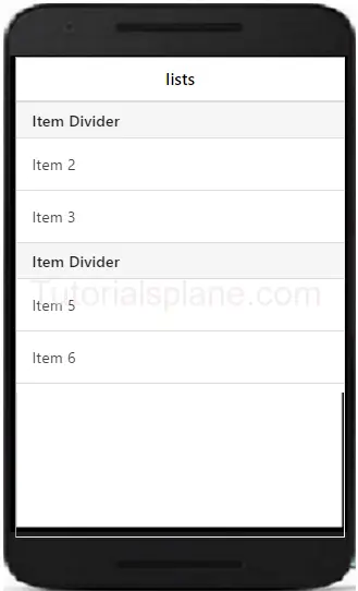
You can add dividers in ionic by adding the class item-divider
List Divider Example
Here is an example of using dividers in lists is-
If you run the above example it will produce the following output-
Ionic List With Icons
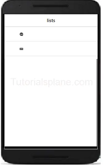
You can add icons in list. You can add position of icons by adding the item-icon-right and item-icon-left
List Icons Example
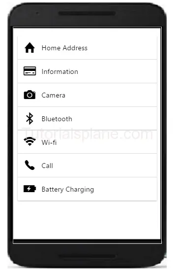
Here is an example of using icons in list-
If you run the above example it will produce the following output-
Ionic Buttons
Ionic Buttons : Buttons plays an important role in any application. Ionic provides beautiful ready made buttons, you can use them frequently. Basic class for buttons used is button. We are going to explain the buttons in ionic framework.
Syntax for Ionic Buttons
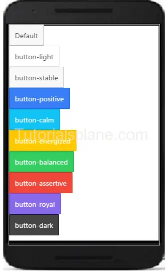
Here is list of buttons in ionic. By default the buttons uses the class .inline-block
If you run the above example it will produce the following output-
Ionic Block Button
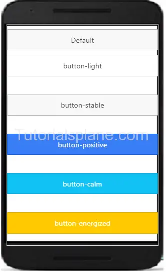
You can use block level buttons as below. Add Class .button-block to create block level button-
The Above example will produce the following output–
Ionic Full Button
You can use full buttons as below. Add Class .button-full to create full button-
The Above example will produce the following output–

Ionic Button Sizes
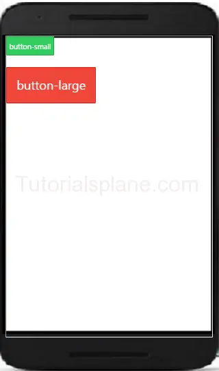
Ionic Basically provides the two size of buttons- small and large. .button-small and .button-large is used to create small and large buttons. Here is an example of button size –
The above example will produce the following output–
Ionic Outlined Button-
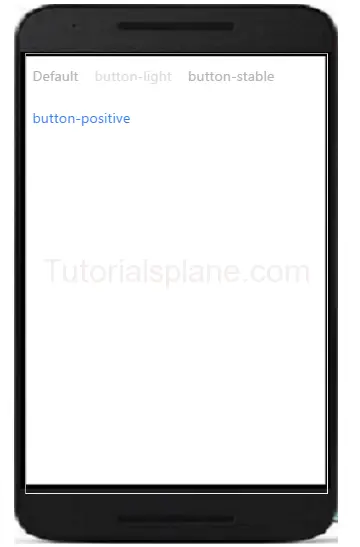
If you want to create button with transparent background and thin border you can use outlined button style. Class .button-outline is used to create outlined button in ionic.
Ionic Clear Buttons-
If you want to remove border and make text in style button. Use . .button-clear to create the buttons with clear style.
Out of the above example will be something like this –
Ionic Button Colors
Here are ionic color options available-
| No | Class | Color name | Color |
|---|---|---|---|
| 1 | bar-light | White | |
| 2 | bar-stable | Light Gray | |
| 3 | bar-positive | Blue | |
| 4 | bar-calm | Light blue | |
| 5 | bar-balanced | Green | |
| 6 | bar-energized | Yellow | |
| 7 | bar-assertive | Red | |
| 8 | bar-royal | Violet | |
| 9 | bar-dark | Black |
Ionic Button Icons
The Above example will produce output something like this –
