
          John Dee johndee@example.com 31m


           Hi My Name is John Dee and i am from London.
Bulma Box– Bulma Css Box is basically simple container which can contain other elements. Class .box is used to create box container in Bulma. Here in this article we are going to explain how you can create box in Bulma. You can use our online editor to edit and run the code online.
Add class .box to create simple container with shadow, border and border radius. You can use it widely for display rich contents such as media object. Here is simple example of box.
If you run the above example it will produce output something like this-
|
If you run the above example it will produce output something like this-

You can run video demo to see the output of the above example-
Bulma File Upload– Bulma Css provides classes to create beautiful file upload input field. It does not uses JavaScript. Here in this article, we are going to explain how you can create file upload input field in Bulma.
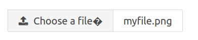
To create basic input file upload you need to wrap input file field by div container with class file. Add label using class label. Add icon to show upload button. Here is an example-
If you run the above example it will produce output something like this-

We can use modifiers with Bulma file upload, Like if want to show placeholder for input file.
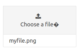
Using .has-name modifier with .file-name you can show the placeholder for selected file.
Add modifier is-fullwidth to make fullwidth file upload.
You can add box style by adding is-boxed modifier.
If you run the above example it will produce output something like this-
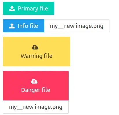
You can use color modifiers to change the color of input file upload.
You can use size modifiers to change the size of input file field. Following sizes are available-
On the same way you can use other size modifiers.
Bulma Form – Bulma Css provides form controls to create beautiful form. Here in this article we are going to explain how to create form controls. You can use our online editor to edit and run the code online.
Following topics are covered in this tutorial-
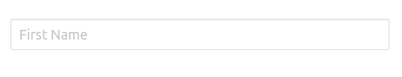
To create a simple input box add class input to input box.
If you run the above example it will produce output like this –
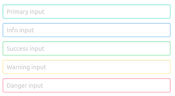
We can use color modifiers to change the input color for example – is-primary, is-info.
If you run the above example it will produce output something like this-
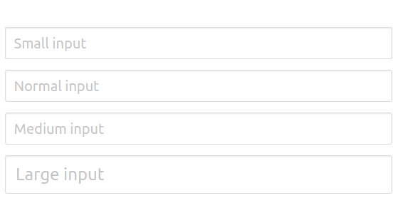
Following sizes are available for input box-
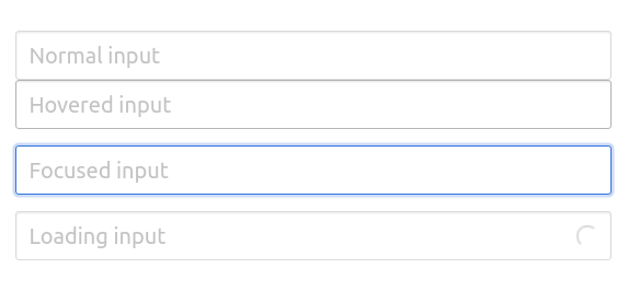
Following states are available-
The output of above example will be –
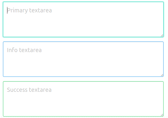
class=”textarea” is used to create textarea in Bulma.
You can change the textarea color using the modifier classes.
If you run the above example it will produce output something like this-
You can change the size of textarea by adding the modifier classes. Following sizes are available-
You can add following states in textarea by adding modifer classes-
If you want to create disabled textarea add attribute – disabled. Here is an example of disabled textarea.
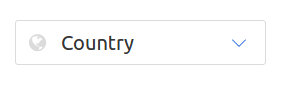
Wrap form select element by class=”select” it will add the style to default select box.
Out of above example-

By adding the modifier class is-multiple, you can change the style of default muli select dropdown.
|
|
You can use modifiers classes to change the dorpdown colors. In the below example we have used color modifier class – is-primary to change the dropdown menu color.
You can add icon to select dropdown menu. Here is an example of icon-
The output of above example will look something like this-
To style checkbox wrap the default checkbox by label class=”checkbox”.

You can create radio button simply as below-
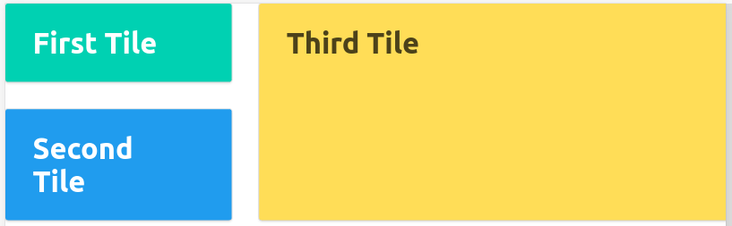
Bulma Tiles– Bulma Css provides classes to create two-dimensional elements called tiles. You can create beautiful tiles layout using these classes. Here in this article we are going to explain the tiles with different-different examples.
Let us create very basic tile. Create an element with class title and then add child elements. Here is an example-
If yo run the above example it will produce the output something like this.
Tiles has following modifiers-
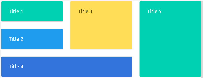
You can create nested tiles using the class- tiles.
If You run the above example it will look something like this –
Bulma Layout Bulma Css provides various classes that can be used to create layout such as – container, media object, section and footer etc. Here in this tutorial,we are going to explain each topics with example and demo.
Following topics are covered in this tutorial-
.container class is used to create container. Container class can be used anywhere but it mostly used direct child of navbar, hero, section and footer.
If you run the above example it will produce the output something like this-

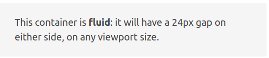
If you want to create a container of full width with 24px margin on left and right side add class is-fluid to container.
|
If you run the above exmaple it will produce output something like this-
Using modifiers – .is-widescreen and .is-fullhd we can create fullwidth container until the specific breakpoints.
Level is basically container which can contain any other element.
To create level you need to create a wrapper element with class – .level then add container with class .level-left and .level-right and then add level item by adding class .level-item.
If you run the above example it will produce output something like this-

If you want to make the level text centered add the class- has-text-centered to the level item container.
If you run the above example it will produce output something like this-

Bulma provides classes to create media object. Media object is basically ui element that is used for repeatable content.
Bulma provides classes to create Hero banners which can be used to showcase something. Class hero and hero-body is used to create hero banner.
On the same way you can change the background color of Hero banner using modifier classes.
If you run the above example it will produce output something like this-

You can watch this video for demo-
Section is basically a container that is used to divide page into parts. Sections are directly used as child of body.
      My Section

       This is simple container.
Bulma provides footer class to create responsive footer. Footer can contain lists, columns, icons and buttons etc.
Bulma Columns– Bulma Css provides simple classes to create responsive columns. It is very easy to create responsive columns in Bulma. Here in this article we are going to explain how you can column container and column class to create responsive columns. You can also use our online editor to edit and run the code online.
This Article contains the following topics-
To create column layout you need to create column container and then add as many container as you want. Here is simple example of column layout.
If you run the above example it will produce output something like this-

You can as many columns you want there is no limitation on it, Bulma will automatically handle the columns on all devices.
There are various classes available that we can use to change the size of column.
is-three-quartersis-two-thirdsis-halfis-one-thirdis-one-quarteris-four-fifthsis-three-fifthsis-two-fifthsis-one-fifthThe columns will occupy the space as class name example -is-half ie. half width of the container. Other columns will automatically manage and adjust in remaining space.
Let us create simple example to understand the above classes.
|
If you run the above example it will produce output something like this- 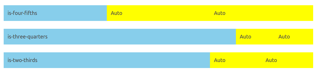
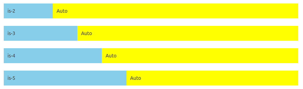
Bulma Also provides classes to create 12 column grid system. Following classes are available to create grid.
is-2is-3is-4is-5is-6is-7is-8is-9is-10is-11Now let us create simple example to understand the grid system.
|
If you run the above example it will produce output something like this-
You can use offset classes to add offset to the columns.
is-offset-x – Where x is number for example – is-offset-2, is-offset-3, is-offset-8, is-offset-11 etc.is-offset-one-fifthis-offset-one-quarteris-offset-one-quarter|
|
If want to create a column to occupy the space that it really needs, use is-narrow modifier class.
|
Following Narrow Modifiers are available-
There are some classes that can be used to handle the responsiveness of the application.
By default columns on mobile devices are stacked on each other. To work columns on mobile add the class is-mobile.
|
Now the above columns will work on mobile devices also.
If you want columns to work on desktop upwards use is-desktop class.
|
We can create nested columns by adding column container and columns inside another column.
|
Bulma provides classes to manage the gaps between the columns.
By default columns have gap with 0.75rem on each side hence gap between two columns is 1.5rem.
We can remove the column gaps using modifier class is-gapless.
|
is-multiline is used to combine the columns.
No gapNo gap
If you want to add variable gaps, use the following classes-
is-0is-1is-2is-3is-4is-5is-6is-7is-8No gapNo gap
Note: Please Add is-variavle class to add the variable gap.
You can use is-multiline modifier to add more column elements that will fit in single row.
You can use the is-centered class to center align the columns in Bulma.
      is-half

      is-narrow
Bulma Modifiers– Bulma Css provides modifier classes which can be used to add the alternative styles. Using Modifier classes you can easily modify the default styles. Modifier classes starts with is- or has-. Here in this article, we are going to explain how we can use modifier classes in Bulma.
Let us understand how modifier classes works step by step.
Modifier classes starts with is- or has- for example- is-primary, is-link. Suppose we want to change the default button style we can use these modifier classes. Now let us go through some important modifier classes.
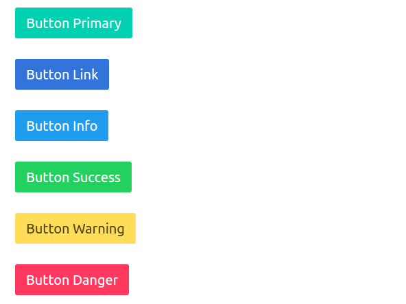
There are following classes that can be used to change the button color in Bulma.
Using the above modifier classes you can create the following buttons-
Button Primary Button Link Button Info Button Success Button Warning Button Danger |
If you run the above example it will produce output something like this-
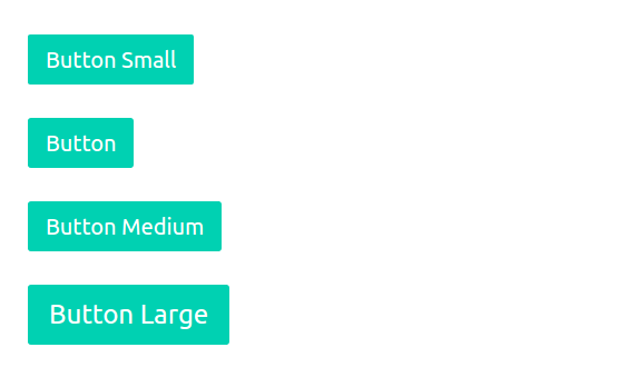
You can create small, medium or large buttons in Bulma. You can use the following classes to change size-
If you run the above example it will produce output something like this-
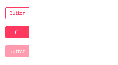
You can create outlined, loading, disabled buttons using the following class-
Output of the above example will be-
Following responsive classes are available which can be used easily anywhere-
is-clearfix– Fixes an element’s floating children
is-pulled-left– Moves an element to the left
is-pulled-right– Moves an element to the right
is-marginless– Removes any margin
is-paddingless– Removes any padding
is-overlay– Completely covers the first positioned parent
is-clipped– Adds overflow hidden
is-radiusless– Removes any radius
is-shadowless– Removes any shadow
is-unselectable– Prevents the text from being selectable
is-invisible-Adds visibility hidden
You can use the responsive helper to show/hide the content based on viewport of device.
You can use following display classes-
block
flex
inline
inline-block
inline-flex
You can use following classes to hide on specific devices-
is-hidden-mobile– Hidden on Mobile devices.
is-hidden-tablet-only– Hidden only on Tablet.
is-hidden-desktop-only-Hidden only on desktop.
is-hidden-widescreen-only– Hidden on wide screen between 1216px and 1407px.
Bulma Installation Steps– It is very simple to install Bulma Css. There are many ways to install Bulma css. Here in this tutorial, we are going to explain the installation steps. You can also use starter template to start quickly.
You can get started with Bulma Css using the one of following method-
Using Npm you can install Bulma Package simply as below-
npm install bulma |
You can also use hosted CDN to include Bulma css. Add the following url in head to include Bulma css.
|
|
If you want to install Bulma locally just download files from https://github.com/jgthms/bulma/tree/master/css and include in head.
If you want to use the icons with Bulma please include font-awesome.
You can start with Bulma using the starter template-
If you run the above example it will produce output something like this-

Bulma Tutorial– Bulma is Open source Modern Css framework which is lightweight, responsive & moduler. Bulma is 100% responsive and designed for mobile first, it is based on Flexbox.
Here in this tutorial, we are going to cover each topic of Bulma framework with various examples & demo.
@import "bulma/sass/elements/button.sass"
Before starting you should have basic knowledge of HTML and CSS.


