Category Archives: Angular Material
Angular Material BottomSheet
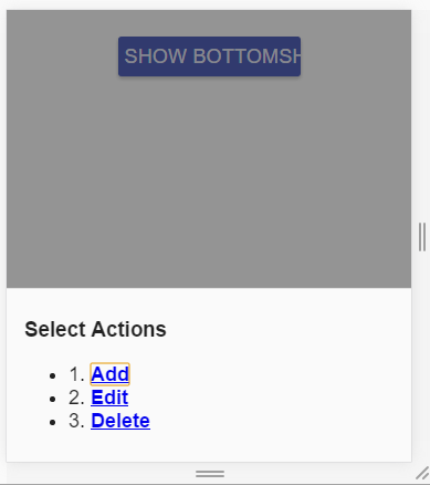
Angular Material – BottomSheet – $mdlBottomSheet service is used to create bottomsheet in Angular Material. It is used to create a sheet which is opened at bottom. This is basically designed for mobile devices. Here in this tutorial we are going to explain how you can create bottomsheet in AngularJs. You can use our online editor to edit and run the code online.
Angular Material BottomSheet | Action Sheet | Demo | Example
Let us create a simple example of bottomsheet in Angular Material-
Basic Example
Here is the very basic example of bottom sheet.
If you run the above example it will produce output something like this –

Methods
Following method is available in bottomsheet-
Bottom Sheet Method:
$mdBottomSheet.show(options); |
This is used to show bottom sheet with the specified options.
For options details you can refer the api service documentation – Api Documentation
Angular Material Autocomplete
Angular Material Autocomplete – Angular Material provides a special input component <md-autocomplte> with a dropdown of all possible matches of custom query. This component provides user the real time suggestions when a user types in an input area. The search results can be provided local or remote sources. Here in this tutorial we are going to explain how you can use Angular Material autocomplete.
Angular Material Autocomplete Example
Let us create a very simple example using the component <md-autocomplte>
JavsScript Part
JavaScript Contains the following code –
Angular Material – Autocomplete Example:
|
|
Html Part
Html Part Contains the following code –
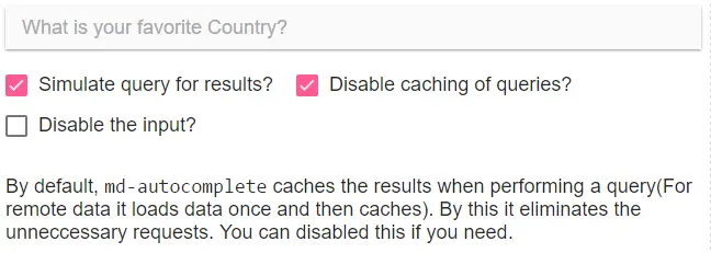
The advantage of autocomplete is that by default, md-autocomplete caches the results when performing a query(For remote data it loads data once and then caches). By this it eliminates the unneccessary requests. You can disabled this if you need.
If you run the above example it will produce output something like this –

Available Options
Following options are available-
-
* md-items:
An expression in the format of item in items to iterate over matches for your search. -
md-selected-item-change(expression):
An expression to be run each time a new item is selected. -
md-search-text-change(expression):
An expression to be run each time on search text update. -
md-search-text(expression)
A model to bind the search query text to. -
md-selected-item(object):
A model to bind the selected item to. -
md-item-text(expression
An expression that will convert your object to a single string ie. placeholder string and this text will be forwarded to the input. -
md-no-cache(boolean):
This is used to disable the internal caching. -
ng-disabled(boolean):
This is used to enable/disable the input. Set true to disable and false to enable the input. -
md-require-match(boolean)
When set to true, the autocomplete will add a validator, which will evaluate to false, when no item is currently selected. -
md-min-length(number):
This is used to specify the minimum length of text before autocomplete will make suggestions -
md-delay(number)
This is used to specify the amount of time (in milliseconds) to wait before looking for results -
md-autofocus(boolean):
If true, the autocomplete will be automatically focused when a $mdDialog, $mdBottomsheet or $mdSidenav, which contains the autocomplete, is opening.
Also the autocomplete will immediately focus the input element. -
md-no-asterisk(boolean)
When present, asterisk will not be appended to the floating label. -
md-autoselect(boolean):
If It is set to true, the first item will be automatically selected as default when dropdown menu is opened. -
md-menu-class(string)
This is used to apply class to the dropdown menu for styling. -
md-floating-label string
This will add a floating label to autocomplete and wrap it in md-input-container -
md-input-name(string)
This is used to assign the name attribute to the input element to be used with FormController. -
md-select-on-focus(string):
This is used to select the element of focus event. -
md-input-id(string):
An ID to be added to the input element. -
md-input-minlength(number) :
This is used to specify the minimum length of the input value. -
md-input-maxlength(number)
This is used to specify the maximum length of the input value. -
md-select-on-match(boolean) :
This will select automatically if the exact matching keyword is found. -
md-match-case-insensitive(boolean)
When set and using md-select-on-match, autocomplete will select on case-insensitive match. -
md-escape-options(string)
This is used to override escape key logic. Default is blur clear.
Angular Material Installation
Angular Material Installation Steps: You can install Angular Material Locally or you can just use it’s cdn version. Here in this tutorial we are going to explain how you can setup environment for Angular Material.
Angular Material Installation
There are two ways to install the Angular Material –
Local Installation
Download the below files and include them locally to setup the Angular Material.
Local Installation Files:
http://ajax.googleapis.com/ajax/libs/angularjs/1.5.5/angular.min.js http://ajax.googleapis.com/ajax/libs/angularjs/1.5.5/angular-animate.min.js http://ajax.googleapis.com/ajax/libs/angularjs/1.5.5/angular-aria.min.js http://ajax.googleapis.com/ajax/libs/angularjs/1.5.5/angular-messages.min.js http://ajax.googleapis.com/ajax/libs/angular_material/1.1.0/angular-material.min.js |
Download the above files and keep them in a folder and provide full path to include them.
CDN Based Version
If you want to use hosted cdn url just include the hosted files simply as below –
CDN Based Version: Installation
|
|
Download the above files and keep them in a folder and provide full path to include them.
Now you are ready to use the Angular Material.
Angular Material Home
Angular Material Tutorial : Angular Material is basically User interface(UI) component library which is built with AngularJs And Material Design Lite. Angular Material basically comes with combined feature of the Angular and Material design lite which enables developers to create beautiful, attractive and responsive web pages. Angular Material is one of the best suited UI component for both mobile devices & Desktop which is platform independent ie develop once and use it everywhere.
Angular Material Tutorial With Example & Demo
Angular Material Lite provides rich layouts, responsive animations, transitions,depth effects such as lighting, shadows, autocomplete, swipe and switches etc which makes it most powerful UI Component. We are sure once you use it, You will love it.
Audience
This tutorial is made for the developers(designers) who are willing to learn the latest Angular Material with example and demo.
What You Should Know?
Before Starting you might be aware of HTML, JavaScript, DOM and AngularJs.
Learn With Example And Demo
You can Learn Angular Material With our online editor to edit and run the code online.
We hope this tutorial will be helpful for you in understanding the Angular Material concept.
The output of the above example will be something like this –

Angular Material Advantages
Let us have a look over Angular Material benefits & features –
- Cross Platform– Angular material enables us to create apps which runs smoothly on each platform which makes it a perfect choice.
- Fast Development– Angular Material Framework provides inbult functionalities which are used in commonly in development.
- Superior User Experience– Angular Material delivers the superior user experience with Material Deisgn lite.
- Easy to Customize– You can easily customize the components of Angular Material.
- Moduler Approach– Angular Material is highly moduler which is integrated with other components very well.
Websites(Web Apps) Built with Angular Material
Here are some famous website that are built with Angular Material Framework-


