Bootstrap Buttons
Bootstrap Buttons : Bootstrap provides button styles which can be used as per our need. Bootstrap’s basic button can be created with simple class name .btn which will add simple button responsive style and compatible to different devices. Here in this tutorial we are going to explain how you can create buttons In Bootstrap With different- different examples. You can also use our online editor to edit and run the code online.
Bootstrap also provides classes to create the buttons of different sizes. You can also use the different button style which represents different state and message.
Bootstrap Buttons Example
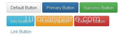
Bootstrap provides some inbuilt buttons which you can use easily for example it provides default, primary, success, info, warning, danger and link buttons .
To Use these classes you just need to the following classes-
- Bootstrap Default Button(.btn-default) – Class .btn-default is used to create Default Button.
- Bootstrap Primary Button(.btn-primary) – Class .btn-primary is used to create Primary Button
- Bootstrap Success Button(.btn-success) – Class .btn-success is used to create Success Button
- Bootstrap Info Button(.btn-info) – Class .btn-info is used to create Info Button
- Bootstrap Warning Button(.btn-warning) – Class .btn-warning is used to create Warning Button
- Bootstrap Danger Button(.btn-danger) – Class .btn-danger is used to create Danger Button
- Bootstrap Link Button(.btn-link) – Class .btn-link is used to create Link Button
Example
Now let us create an example to understand the buttons in Bootstrap.
Bootstrap Buttons : Example
<p><button type="button" class="btn btn-default">Default Button</button></p> <p><button type="button" class="btn btn-primary">Primary Button</button></p> <p><button type="button" class="btn btn-success">Success Button</button></p> <p><button type="button" class="btn btn-info">Info Button</button></p> <p><button type="button" class="btn btn-warning">Warning Button</button></p> <p><button type="button" class="btn btn-danger">Danger Button</button></p> <p><button type="button" class="btn btn-link">Link Button</button> </p> |
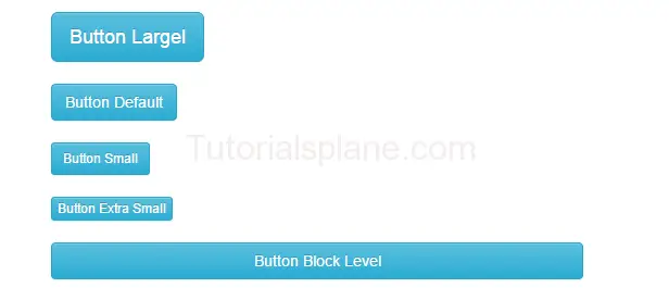
Bootstrap Button size
We sometimes need different-different button sizes, bootstrap provides you buttons of different-different sizes such as – Large, small, block level buttons.
Here are following button sizes available in bootstrap –
[table width=”100%” colwidth=”20|100|50 |50″ colalign=”left|left|left|left”]
no,Size,Class, Description
1 , Large Button, .btn-lg, This is used to create large button
2 , Default Button,.btn, This is used to create regular button
3 , Small Button,.btn-sm, This is used to create small button
4 , Extra Small Button,.btn-xs,This is used to create Extra small button
5 , Block Button,.btn-block, This is used to create block level button
[/table]
Bootstrap Button Size :
<button class="btn btn-info btn-lg " type="button">Button Largel</button>
<button class="btn btn-info " type="button">Button Default</button>
<button class="btn btn-info btn-sm" type="button">Button Small</button>
<button class="btn btn-info btn-xs" type="button">Button Extra Small</button>
<button class="btn btn-info btn-block" type="button">Button Block Level </button>
|
|
|
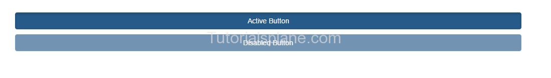
Bootstrap Buttons States
You can represent the states with the Active and Disabled states.
.active class is used to make the button in active state.
.disabled class is used to make the button in disabled state.
Bootstrap Button States : Active/Disabled
<p><button type="button" class="btn btn-primary btn-block active">Active Button</button> </p> <p><button type="button" class="btn btn-primary btn-block disabled">Disabled Button</button> </p> |
If want to create or learn about the button groups go to the Next Page ….
Advertisements


